Prerequisites
Next.js is constructed leveraging Node.js. and React js as its foundation. To initiate your journey with Next.js, it's essential to have an up-to-date version of Node.js.
Thank you so much for purchasing our item from ThemeForest
Hello! Welcome to Aximo's official documentation. Simple, Flexible, ready to use Next.js Template which will bring you so much closer to your end goals. Let’s dive in.
Next.js is constructed leveraging Node.js. and React js as its foundation. To initiate your journey with Next.js, it's essential to have an up-to-date version of Node.js.
We require many packages (dependencies)
to run our site.
Move into /Aximo (project
root) directory and run
command below.
npm install
After the installation, you should have
a folder named
/node_modules in the
project root directory..
To start our development server run command below:
npm run devOpen your browser and visit http://localhost:3000!. You should see a page like below.
Awesome! You are a
genious. Now
open the code editor and start hacking!
Some useful commands to work with the project.
1. npm run dev to Start
development server at
http://localhost:3000
2. npm run build for
Generating production build
3. npm run start To
serve build files at
http://localhost:3000
Follow the steps below to setup your site template:
Aximo-next/src/components
- Component filesAximo-next/src/pages
- All pagesAximo-next/src/assets
- Asset files
Aximo-next/src/router
- Routing files
Aximo-next/font.js
- Custom FontAximo-next/index.html
- Root fileYou can update the logo by simply replacing it with a new logo of the same name.
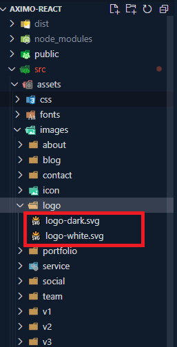
1. Navigate to the
public/assets/images/logo
directory within your project.
2. Locate the existing logo file that you wish to replace. Ensure that the replacement logo you have matches the same file format (e.g., PNG, JPG, SVG) and has the same name as the original logo file.
3. Once you've found the original logo file, simply replace it with your new logo file. Make sure to use the same filename to ensure that the project references the new logo correctly.
4. After replacing the logo file, any references to the logo throughout your project will automatically reflect the changes, as long as they are referencing the file by its filename.
5. You may need to restart your development server or rebuild your project for the changes to take effect, depending on your development environment.
6. That's it! You've successfully replaced the logo in your project.
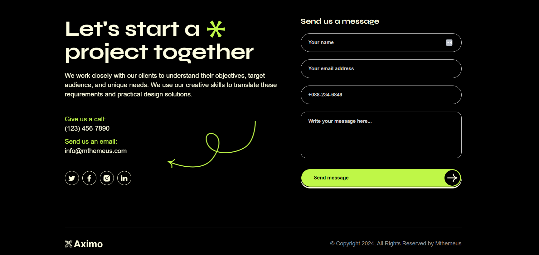
Documentation and examples for layout, header and footer.
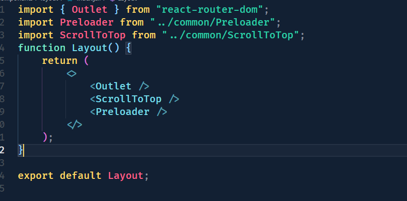
To Integrate
Prelaoder and
ScrollToTop
component your need to use
root/main Layout
component. Here's how
you can use the
src/componetns/layout/index.jsx
Layout component
in your project:
To integrate header and footer into
your pages, navigate to the
src/components/layout/
directory.
The LayoutOne component
serves as a container for your page one
content and includes the
src/components/home-one/header/index.jsx
and
src/components/home-one/footer/index.jsx
components. Here's how
you can use the
LayoutOne component
in your project:
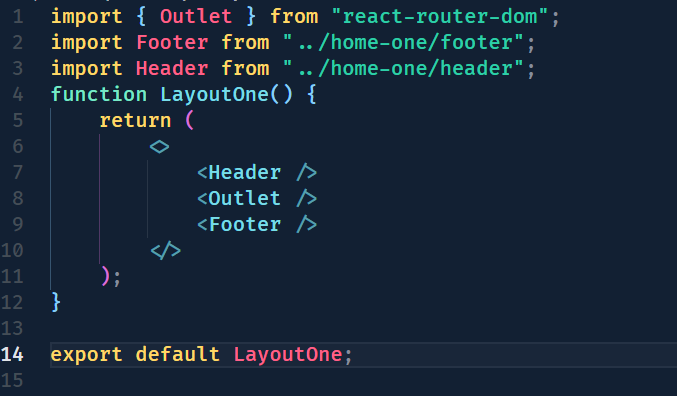
In this code snippet, the
LayoutOne component
wraps header, footer and other contents of your
pages, providing a consistent layout
structure. It includes the
src/components/home-one/header/
component at
the top and the
src/components/home-one/footer/
component at
the bottom. You can use this
LayoutOne component as
a wrapper for your page content,
ensuring that the header and footer
are displayed consistently across
your application.
This approach facilitates code reuse
and makes it easy to maintain a
unified design across multiple
pages. Simply import and use the
LayoutOne or LayoutTwo or LayoutThree or LayoutFour or LayoutFive or LayoutSix or LayoutSeven
component in
your router/index.jsx
file to incorporate
the header and footer into your
application layout seamlessly.
In the project structure, the header
components are located within the
src/components/home-[one/two/three/four/five/six/seven]/header
directory. There are four header variations
designed to be utilized across the
application. Each header corresponds to a
specific layout or design variation,
catering to different sections or pages.
Inside the
src/components/home-one/header/index.jsx
folder, you'll find Header Variant One
component.

Inside the
src/components/home-two/header/index.jsx
folder, you'll find Header Variant Two
component.

Inside the
src/components/home-three/header/index.jsx
folder, you'll find Header Variant Three
component.

Inside the
src/components/home-four/header/index.jsx
folder, you'll find Header Variant Four
component.

Inside the
src/components/home-five/header/index.jsx
folder, you'll find Header Variant Four
component.

Inside the
src/components/home-six/header/index.jsx
folder, you'll find Header Variant Four
component.

Inside the
src/components/home-seven/header/index.jsx
folder, you'll find Header Variant Four
component.

The list of various footer types & its
descriptions are
provided below for your reference: Inside
the
src/components/home-[one/two/three/four/five/six/seven]/footer
folder, you'll find three distinct footer
components contributing to the project's
structure.
Inside the
src/components/home-one/footer/index.jsx
folder, you'll find Footer Variant One
component.
Inside the
src/components/home-two/footer/index.jsx
folder, you'll find Footer Variant Two
component.
Inside the
src/components/home-three/footer/index.jsx
folder, you'll find Footer Variant Three
component.
Inside the
src/components/home-four/footer/index.jsx
folder, you'll find Footer Variant Four
component.

Inside the
src/components/home-five/footer/index.jsx
folder, you'll find Footer Variant Five
component.
Inside the
src/components/home-six/footer/index.jsx
folder, you'll find Footer Variant Six
component.
Inside the
src/components/home-seven/footer/index.jsx
folder, you'll find Footer Variant Seven
component.
Documentation and examples for displaying typography, table, image and video and more..
Documentation and examples for typography, headings, body text, lists, and more.
| Heading | Example |
|---|---|
<h1></h1>
|
h1. Heading |
<h2></h2>
|
h2. Heading |
<h3></h3>
|
h3. Heading |
<h4></h4>
|
h4. Heading |
<h5></h5>
|
h5. Heading |
<h6></h6>
|
h6. Heading |
You can use the mark tag to highlight text.
This line of text is meant to be
treated as deleted
text.
This line of text is meant to be treated
as no longer
accurate.
This line of text is meant to be treated as an addition to the document.
This line of text will render as underlined
This line of text is meant to be treated as fine print.
This line rendered as bold text.
This line rendered as italicized text.
<p>You can use the mark tag to <mark>highlight</mark> text.</p>
<p><del>This line of text is meant to be treated as deleted text.</del></p>
<p><s>This line of text is meant to be treated as no longer accurate.</s></p>
<p><ins>This line of text is meant to be treated as an addition to the document.</ins></p>
<p><u>This line of text will render as underlined</u></p>
<p><small>This line of text is meant to be treated as fine print.</small></p>
<p><strong>This line rendered as bold text.</strong></p>
<p><em>This line rendered as italicized text.</em></p>
The Fontawesome Icons and Iconmoon Icons library is a popular set of icon components for any applications. It provides a collection of icon components that can be easily integrated into your React/Next.js projects, allowing you to add icons to your user interface without the need for external image files.
A FAQ is a list of frequently asked questions (FAQs) and answers on a particular topic.
Contact with us: wpsakib@gmail.com
See what's new added, changed, fixed, improved or updated in the latest versions.
Initial Release